- PR
Shelf appeal: Less about shouting, more about belonging?


Photo credit: Feel, wearefeel.com
For decades, “shelf appeal” has been about winning the battle for attention in the supermarket aisle. Bold colours, oversized logos and eye-catching graphics were the tried-and-tested weapons in the fight against competitors. The goal was simple: grab the shopper’s gaze in a split second and convert it into a purchase.
But in today’s FMCG landscape, that definition feels increasingly outdated. The way we shop, live and display products has evolved, and so too has the meaning of shelf appeal. It’s no longer just about visibility in the retailer’s aisle. Increasingly, it’s about how products look once they arrive in the consumer’s home – on kitchen counters, in bathroom cabinets and even in social media posts.
Modern consumers are looking for products they’re proud to display. They want items that blend seamlessly into their lifestyles and homes, rather than garish packs that scream for attention. There’s been a shift from shouting to styling: neon colours, oversized fonts and excessive claims – once the staples of shelf appeal – now feel dated, even off-putting. In their place, we’re seeing a rise in subtlety: pared-back palettes, minimalist typography, and design cues borrowed from beauty, fashion and interiors. A growing number of brands are adopting an aesthetic that looks as at home on a bathroom shelf as it does in a glossy magazine photoshoot.
It’s not just about being easy on the eye. Design has become a brand statement, a differentiator in crowded categories where functional benefits alone are no longer enough. Some FMCG players are even taking direct inspiration from fashion, both in their creative approach and in their collaborations.
Wild’s recent tie-up with Cath Kidston, for instance, brought heritage prints to refillable deodorants, turning a personal care essential into a collectable accessory. Other brands – from Feel and Good Phats in nutrition, to Byoma in skincare and Ordo in oral care – are making design itself a core part of their proposition. Their products are marketed as much for their aesthetic value as for their efficacy, appealing to consumers who want items that elevate their shelves rather than clutter them.
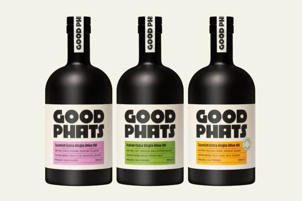
Photo credit: Good phats, goodphats.com
This shift hasn’t happened in a vacuum. Social media has turbocharged consumer expectations around packaging and product design. A decade ago, only a handful of beauty or lifestyle products ever made it into the public eye via a glossy advert or endorsement. Today, anyone can showcase their morning routine or kitchen set-up to thousands of followers with a single post.
In that context, the products in the shot need to look the part. Packaging has become content. For brands, this creates both an opportunity and a challenge: get it right, and your product becomes part of a consumer’s curated personal brand. Get it wrong, and it risks being left behind, hidden in cupboards or swapped out for something more “Instagrammable.”
While start-ups and challenger brands are often leading the charge, more established players are finding it harder to keep up. Legacy designs and entrenched brand codes can be difficult to update without alienating existing customers. But clinging too tightly to old visual identities risks making products look outdated or out of touch with modern lifestyles.

Photo credit: Byoma, byoma.com
That’s why some heritage brands are experimenting with design-led limited editions, collaborations or sub-brands that allow them to explore more contemporary aesthetics. It’s not always about wholesale change, but about showing consumers you understand their evolving expectations and are willing to adapt.
The meaning of shelf appeal has broadened. It still matters in-store – consumers can’t buy what they don’t notice – but it matters just as much, if not more, in the home. Packaging now has to deliver across both contexts, standing out at the point of purchase and fitting in once purchased.
The business case for this shift is compelling too. Research shows that brand perception improves by 50% when packaging is innovative and attractive[1]. In other words, design isn’t just about looking good on the shelf – it directly shapes how consumers value and trust a brand.
For FMCG brands, the challenge is to balance clarity and visibility with desirability and subtlety. It’s no longer enough to shout from the shelf. The winning designs are those that invite consumers to bring products into their lives – and proudly put them on display.
By Ian York, Head of Visual Content, Studio Nexus
[1] zipdo education report 2025
« Why legacy brands are losing ground in the new wellness era Winning in self-care: Why strategy and PR matter more than ever »